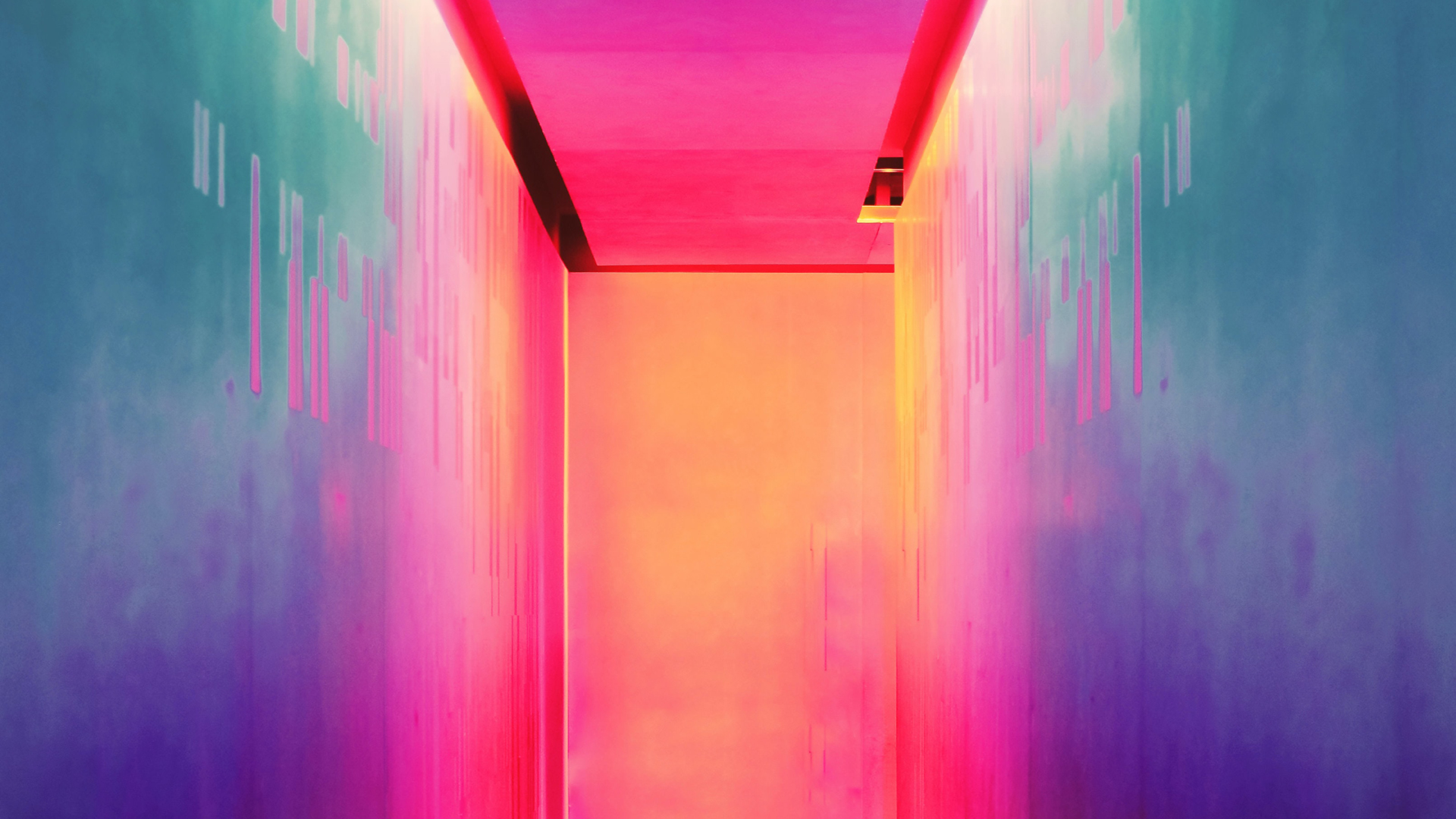
Colour Trends in 2022
Published by Admin on
May 4, 2022 8:29:41 AM
Colour is an omnipresent and powerful element of our existence but, sometimes, we don’t even realise its importance or its effect on us. Different colours hold cultural significance around the world. Certain colours can change our mood. It communicates warnings, creates an identity for brands and can act as a universally understood language.
Each year, colours rise and fall in trend reports. These cycles occur as an expression of what society is feeling in response to political, economic, lifestyle and health movements at that particular time. Colour trends are a thread of our history but also a mirror of our present. Let’s explore what colours are predicted to dominate style and conversation in 2022.
Pantone's colour of the year
In the 22 years since Pantone has announced its Colour of the Year, the institute has never presented a brand new colour. It made headlines when the pick for 2022 was announced as PANTONE® 17-3938 Very Peri, a dynamic periwinkle blue with a vibrant, violet-red undertone that Pantone invented.
What is significant about the colour isn’t necessarily its composition but rather it's meaning. Pantone stated that it created a new shade to represent the new vision of the world now. Very Peri is all about newness and speaks to the focus on digital innovation as it represents how our online lives are converging with our real-world behaviours.
And this is one of the most important shifts in the decisions behind the colour trends for 2022:
Colours linked to seasons are no longer as important as they used to be, instead, we’re focusing on how colour makes us feel. This makes colour ageless, able to transcend across seasons and serve as a representation of the feeling of a time.
In the case of Very Peri, it is designed to make people feel happy. It could also evoke the feeling of excitement over new technology as it hints at the subtle blue glow of screens at a time when human life is increasingly shifting to the digital realm.
Feeling blue in a good way
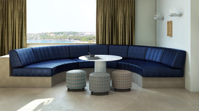
One of the reasons Pantone chose a shade of blue is because people want freshness, optimism and hope. Blue continues to be a perennially popular colour and can easily shift from cool and calming to warm and energising depending on the tone.
“In 2021, we saw high demand for blue: from denim to dark inky navy. We believe the colour will continue to be strong in 2022 because of its variety and versatility.” Gemma Powers, Brand Manager, Bru Textiles
A handful of international paint brands have included blue among their 2022 palettes or as their colour of the year, citing a feeling of freedom, a connection to air and water and the soulful properties of blue as reasons behind the choice.
Thinking green
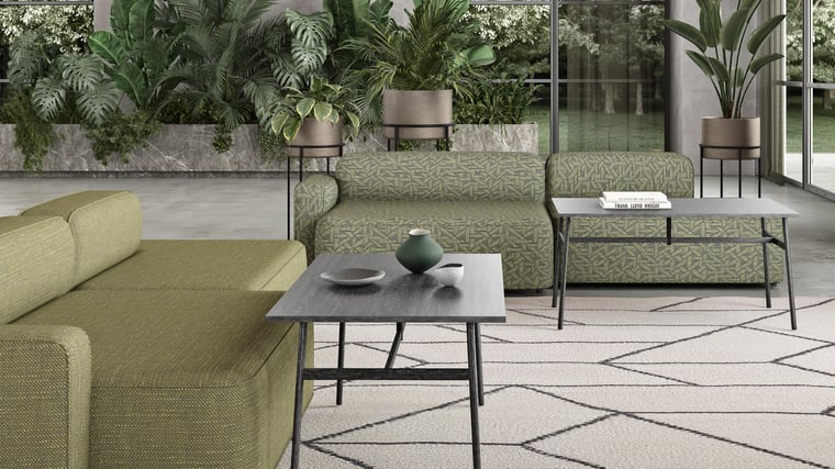
From paint brands to Shutterstock, green has been touted as one of the most important colours for 2022. With themes of wellness, mental health and a renewed appreciation for nature dominating lifestyle news and trends, green has become the symbolic colour of wellbeing.
For interiors, the favoured shade is a gentle green-grey. The colour is versatile and can essentially function as a neutral so it works for most interiors. In fashion, a much brighter and sharper shade of crisp or neon green is on the rise. Meanwhile, in the digital world, it is tones of emerald, jade and lime that attract clicks.
 All the jewel tones
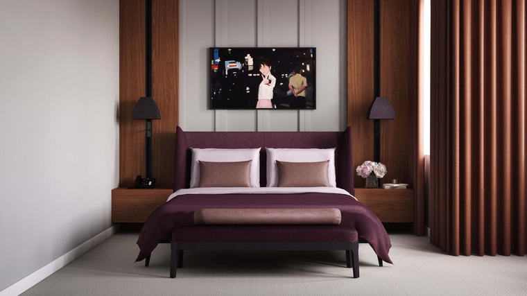
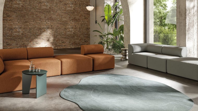
A trend that Bru sees on the rise for 2022 is richer shades, particularly in velvet fabrics. Spicy, comforting, deep hues work particularly well with velvet to create a classic style statement that can work in contemporary design. Think forest green or tones of emerald, earthy burnt orange, eggplant or ink blue.
A big decor trend for 2022 will be soft curves and velvet is the perfect fabric choice. Creating soft natural shapes with a plush textile in a rich tone will also speak to the vintage design trend and can be an enduring statement that looks and feels gorgeous for years to come.
 Seeking serenity
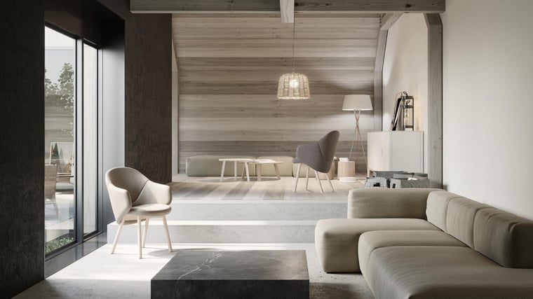
One of 2022’s biggest interior colour themes will be serenity. With more people working from home and focusing on wellness, a gentle, natural colour palette will be favoured.
“Serene colours, like soft naturals, are likely to continue to be strong because they are easy to live with; they suit all interiors and can be used in a range of applications: wall colour, curtains, bedding, upholstery. It’s also easy to combine a range of serene tones.” - Gemma Powers
Neutrals such as cream, soft grey, navy and charcoal can form the base of a serene colour palette. What makes this trend different is the choice of accent colours with calming coral, soft pinks and gentle shades of blue and green adding interest.
Serenity in colours expresses our desire for comforting spaces that allow us to decompress and feel safe while adding a splash of playfulness. It is sophisticated but doesn’t take itself too seriously, keeping relaxation as the focus.
 A world of colour
It can be tough to choose the right colours for a project. What is exciting about 2022’s colour trend forecast is that there is something for everyone. Go bold with brights or feel right at home with timeless favourites. Again, it’s all about how colours make us feel.
For 3D designers, the number of colours to choose from is vast. Twinbru makes this selection easier with a digital fabric library. Each market-ready physical fabric is shown in all its available colourways. Simply browse the library, make your selection and apply it to your 3D model. Currently, a selection of our digital fabric twins is available on NVIDIA Omniverse to apply in collaborative projects on the platform. Our digital fabric twins are also available on Kujiale to create breathtaking interiors.
If you’re in need of colour inspiration, head to our Render page or follow our Pinterest boards where can create your own mood boards featuring on-trend tones in our digital fabric twins.