Why do screens struggle with real-world colour?
Every interior designer has lived this nightmare: the fabric that looked perfect in your render arrives at the installation site in completely the wrong colour. That rich burgundy you specified appears as muddy brown. The warm eucalyptus green reads as grey. The client is furious and your professional reputation takes a hit.
This isn't a minor technical issue. According to X-Rite, incorrect colour specification leads to product rejections, with wrong-colour items feeding discount stores whilst manufacturers absorb the losses. Each lab-dip submission costs over £100, and companies often require six attempts before achieving correct colour. One interior designer's specification error resulted in a £10,000-15,000 kitchen respray.
The culprit? A fundamental disconnect between how the physical world handles colour and how digital systems represent it. The physical world operates spectrally – colour is electromagnetic radiation measured across hundreds of wavelength points. Digital systems operate in RGB – reducing all those wavelengths to just three numbers. It's like trying to describe a symphony using only three notes.
What makes 2026 colour trends so challenging?
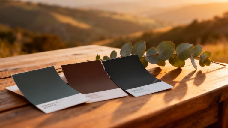
The colour trends for 2026 make this challenge critical. Paint manufacturers have announced sophisticated colours: Behr's Hidden Gem (a complex smoky jade), Benjamin Moore's Silhouette (a deep espresso-charcoal) and multiple variations of warm eucalyptus greens. These aren't simple primary colours – they're nuanced hues with subtle undertones that shift dramatically under different lighting conditions, exposing RGB display limitations mercilessly.
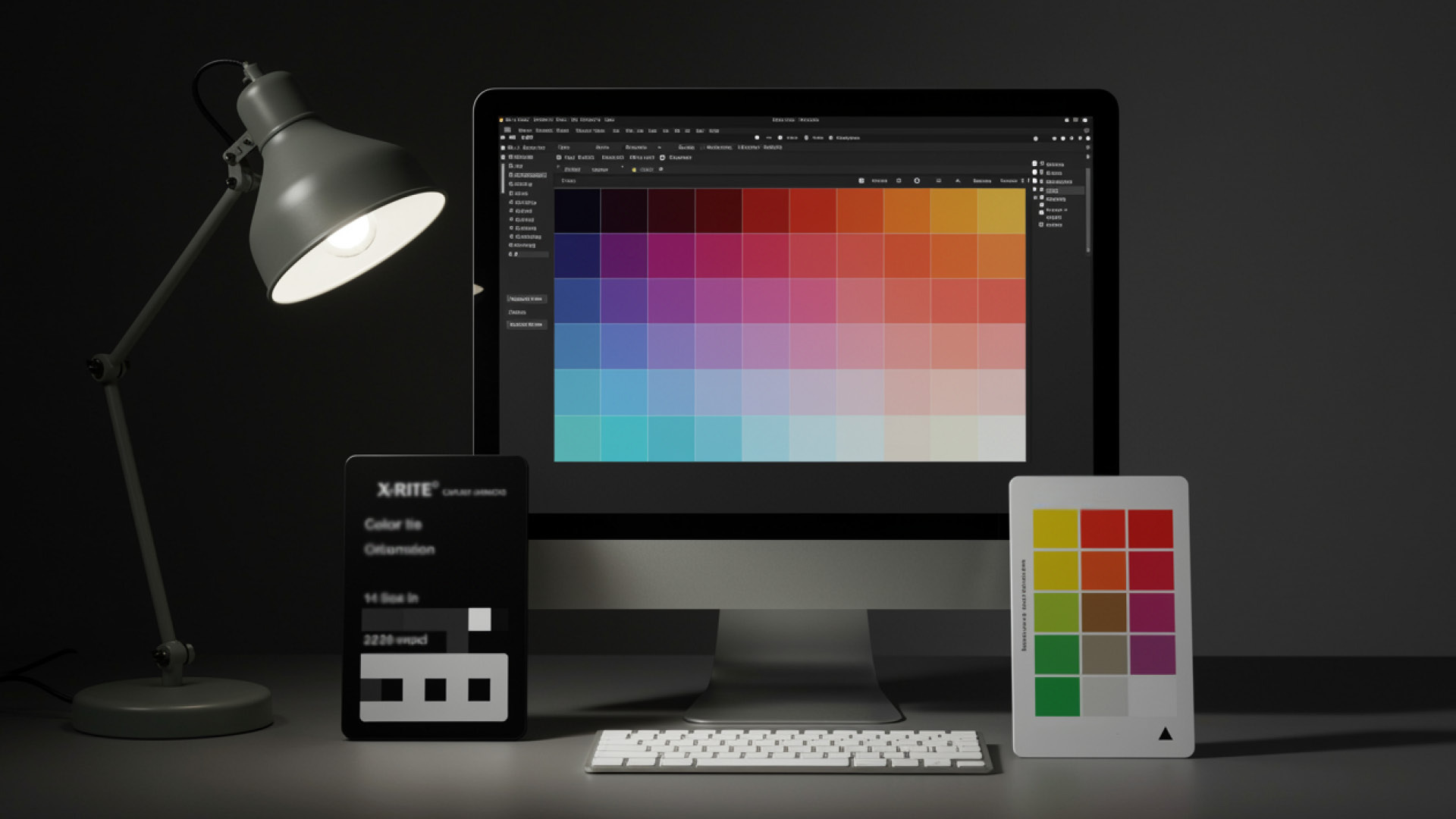
How do colour spaces work?
Think of colour spaces as boxes of crayons. sRGB, developed by Microsoft in the early 1990s, was a small crayon box – limited colours that early monitors could reproduce. Around 2015-2016, Apple introduced Display P3 – a significantly wider crayon box that became the new standard for modern displays and web browsers. But even Display P3 can't match the full range of colours that X-Rite scanners capture from physical fabrics.
The problem compounds because RGB screens emit light whilst physical fabrics absorb it. Fabric colour is also affected by weave structure, fibre composition, surface texture and viewing angle.
What systems do professionals need?
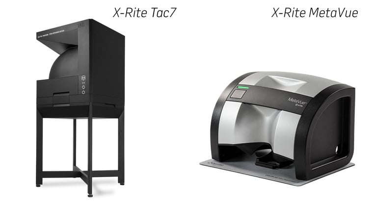
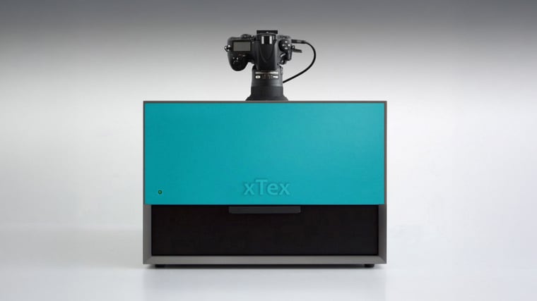
X-Rite Tac7 captures fabrics accounting for three-dimensional structure and complex light interaction. It measures how materials respond to light from multiple angles, capturing eight or nine characteristics: diffuse colour, roughness, specular reflections, normal maps, displacement, transparency and translucency.
X-Rite MetaVue measures colour with spectral accuracy across hundreds of wavelength points.
How does Twinbru's colour workflow work?
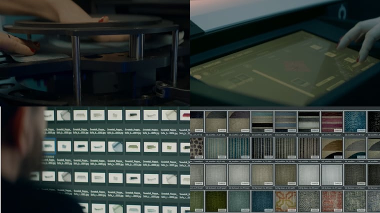
Physical Measurement: X-Rite Tac7 captures surface detail, weave structure and baseline spectral colour data. What the scanner measures becomes the authoritative record.
Colour Standardisation: The breakthrough in colour management came with OCIO (Open Colour IO) – a standardisation initiative from the visual effects community. OCIO provides a universal framework for controlling colour from capture through rendering to final display. Major applications – 3ds Max, Maya, Blender, Photoshop – now support this standard, allowing different software to communicate about colour consistently.
Captured data flows into DMIx, our colour management platform for textiles. DMIx maintains colour standards across the production pipeline, ensuring spectral measurements translate correctly through OCIO transforms into rendering engines like V-Ray.
Digital Twin Creation: Standardised data becomes our digital fabric materials, including how colour shifts under different lighting conditions and viewing angles. V-Ray uses OCIO transforms to ensure RGB values on screen accurately represent the spectral measurements captured.
Validation Loop: Digital renders are compared against physical samples under controlled conditions. We use calibrated Eizo screens with OCIO-compliant viewers. Physical fabrics are examined in D65 light booths providing standardised daylight illumination.
Validation team members are trained using Labotex colour vision tests. After 30-40 minutes viewing similar colours, brains begin compensating automatically – you stop seeing colour shifts that are actually present. That's why validation includes mandatory breaks and neutral grey environments.
If samples match within tolerances, materials are validated. If we see shifts, we investigate the pipeline to identify problems.
What does advanced colour management solve?
Modern colour management provides a library of recorded colours matched against specific compositions. It enables digital creation of new fabrics and precise communication of colour requirements to suppliers through spectral data. It allows colour development across multiple sites, so teams in London, Portugal and South Africa work from identical specifications.
What does colour error cost?
X-Rite reports that colour errors lead to product rejections and discount store sales. Project delays trigger penalty clauses. Rush shipping eats into margins. On large commercial projects – hotels, corporate headquarters, healthcare facilities – colour errors are catastrophic. When you've specified 500 metres of upholstery fabric based on digital visualisation, discovering the physical product doesn't match is a career-defining disaster.
Can smaller studios access this technology?
You don't need to own X-Rite equipment. Libraries like Twinbru's provide access to professionally-scanned fabrics with validated colour data. The critical discipline is resisting the temptation to "adjust" colours to look better on screen. That vibrant boost you add introduces the exact distortion causing physical mismatches.
What about end-user display limitations?
Here's the uncomfortable truth: we cannot control what happens when images reach end users. We generate perfectly colour-managed renders using OCIO standards and spectral data. We embed colour profile information into files. But we have no control over client displays, browsers or viewing conditions.
Operating systems have "night mode" features that automatically shift colours. Display cables matter – older HDMI connections crop colour data whilst DisplayPort preserves it. Video card drivers affect output. Browser choice matters – Chrome handles colour management differently than Safari or Firefox.
This is why validation with physical samples remains essential. Digital renders guide design and communication, but physical sample verification before large orders remains the only way to guarantee accuracy.
Why is colour accuracy a professional requirement?
As clients become more sophisticated and project stakes get higher, colour accuracy is a professional requirement. Datacolor research shows inconsistent colour damages brand reputation, whilst companies like Walmart have cut colour approval timelines from six weeks to three weeks using proper colour management.
When you present renders using properly colour-managed fabrics, you're providing accurate specification data clients can confidently use for purchasing decisions. X-Rite systems and workflows aren't about perfectionism – they're about professionalism. They're about ensuring what clicks in your render matches what arrives at installation.
Ready to eliminate colour guesswork?
Every fabric in Twinbru's digital library has been scanned using X-Rite Tac7 and MetaVue systems, with colour management through DMIx and OCIO standards ensuring accuracy from screen to specification. Our validation process guarantees that what you render is what your clients receive.
Explore our spectrophotometrically-verified FibreGuard collection at twinbru.com – over 12,000 fabrics with colour data you can trust, from digital specification to physical installation.
Stop guessing. Start specifying with confidence.